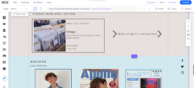
The first image shows the header and masthead of my website, with a horizontal menu and the beginnings of an 'about us' section. This was the first draft of my website and colour palette and I did change the colours because I thought it was too plain with the basic black and white.
--------------------------------------------------------------------------------------------------------------------------
This was my second draft of my website where I change the colour palette to a soft beige colour which is still plain, which conforms to other music magazine websites, but it gives more colour than white.
I included an 'About Us' section on the home page which I saw other webistes often had in my prelimary research.
On the homepage, I included a 'This Edition' and 'Acrhive' section which promotes the current and past editions that music magazine published. Again, this was also a well-used feature in other magazine websites so I included it in mine to make it conform to the generic conventions.
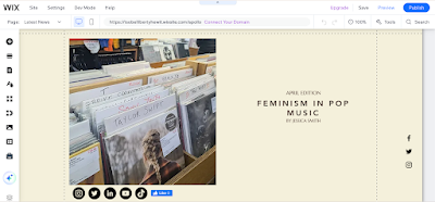
This is the first part of content on my linked page which is under 'Articles'; you can access this page through the 'Articles' menu tab and the 'More' button under the four magazine articles at the top of the home page. The linked page is an article on Feminism in Pop Music, of which I have planned and written.
I inserted social media tabs under the main image and Facebook like button which is common under online articles to increase engagement.
Next to the article, I created adverts that are designed to appeal to the target audience with topics like university, cinemas and booking your first holiday.


