Thursday, March 20, 2025

Production Task Two: Log of the Website

The first image shows the header and masthead of my website, with a horizontal menu and the beginnings of an 'about us' section. This was the first draft of my website and colour palette and I did change the colours because I thought it was too plain with the basic black and white. 


--------------------------------------------------------------------------------------------------------------------------

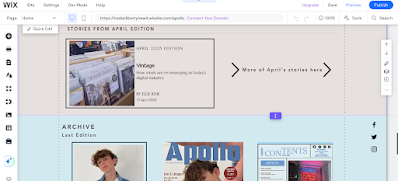
This was my second draft of my website where I change the colour palette to a soft beige colour which is still plain, which conforms to other music magazine websites, but it gives more colour than white. 


I included an 'About Us' section on the home page which I saw other webistes often had in my prelimary research. 


On the homepage, I included a 'This Edition' and 'Acrhive' section which promotes the current and past editions that music magazine published. Again, this was also a well-used feature in other magazine websites so I included it in mine to make it conform to the generic conventions. 


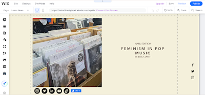
This is the first part of content on my linked page which is under 'Articles'; you can access this page through the 'Articles' menu tab and the 'More' button under the four magazine articles at the top of the home page. The linked page is an article on Feminism in Pop Music, of which I have planned and written.
I inserted social media tabs under the main image and Facebook like button which is common under online articles to increase engagement. 


Next to the article, I created adverts that are designed to appeal to the target audience with topics like university, cinemas and booking your first holiday. 


Monday, December 9, 2024

Production Task Two: Log of Contents Page

Contents Page 1 


The first image is the first log of the production of contents page 1 which will coincide with front cover one. I have altered the positioning of the contents title because I feel like having the letters askew from each other is interesting and adds a unique element.


The second image is of the contents page after I have added a line to separate the title from where the content will go below. I have also added my pictures that will anchor content lines. 


The third image shows the stage of inputting the content lines onto the contents page. There are more lines than on my original plan because I found that I had planned for too few content lines and the page would have looked too empty so I've created more so the page is busier.  The red font matches the red used on the front cover which gives the two media pages cohesiveness.


The fourth image shows my first contents page with the page numbers aligning with the content lines. The circles in the images anchor the specific image to the content line; the colours of said circle is the same colour as the main red font which links the two aspects to the front cover of this contents page. The numbers are in serif font because it contrasts the sans-serif font nicely and coordinates with the main 'CONTENTS' headline at the top of the page. 


In this image, it shows my first contents page with the social media links inputted, a link to the website  and a section that the reader can use to contact Apollo and give feedback. These sections promote the digital participatory elements of the magazine where the reader can explore more of my magazine. I have used sans-serif font through these elements because it reflects the modern and contemporary components of my magazine: the website and social media sites. 


The image below shows the final product of my first contents page. In the final stage, I input a section that links this edition to a Spotify playlist; this increases the links to online media and targets the 16-24 year old demographic who is digitally inclined. Furthermore, the blue colour of Spotify code is similar to the blue colour scheme of the page and blends into the page well. 


I added lines onto the contents page because it adds a level of neatness to the page by dividing the content. 


Contents Page 2

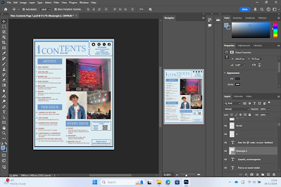
Below is the first image of second contents page's progress and it has the same title layout as the first contents page which creates consistency between the two editions. The colour scheme reflects the colour scheme on the front page of the second edition.  


This stage shows more plugs inputted onto my second contents page and the images it will feature. The website and social media links are so the reader has the opportunity to see the other pages for my music magazine. 


The next image shows the content lines on the page, highlighting what this edition would have as articles. The content plugs also coincide with the colour scheme of this page as well. The font is the same sans serif font as the first front cover which generates a contemporary and coordinated feeling to the page. 


I added lines of separation to the contents page to make the page look fuller and neater. The lines are the same colour as the border of the contents page which enhances the cohesion of the different elements.


Sunday, October 6, 2024

Production Task Two: Production Log

 The screenshot below shows the initial progress for cover 1. I have created a new file, uploaded my main image on the male model, added the masthead and strapline. I have chosen the blue colour for the masthead because it anchors with the denim jacket of the male model and is aesthetically pleasing to the audience. 


Next, I focused on adding the content plugs. In my original design, the content plugs were to be at the top of the page but I have moved them to the bottom because with the layout of the main image and masthead positioning, text would have been blocking the model's eyes from the audience. I have coloured the plugs red because blue blended in too much and I colour matched the red of the letters to the red of the patch on the denim jacket. I have changed the font of the strapline to Gabriola because Vallite was easily missed on the page. Gabriola has the same hand-written feel to it but is bolder and you can see it better on the page. 


After that, I focused on the main coverline 'Finn Johnson / Student Turned Rockstar'. 


The image below shows the stage further along the production process where I have added the coverlines, the barcode and the date. I have also made alterations since the last log: I have added a rectangular box over the content plugs and changed the font to white to make them stand out. I made the masthead smaller and widened it to make room for more content on the page, without making it looked cramped. I lowered the main coverline to make room for the other coverlines. 


The image below is the finish point for cover one of my Apollo Music Magazine. I finished by adding the puff to alert the reader of the discount of the first publication and a puff for to promote the website and give an incentive for the audience to visit the website.


Cover 2

Below is the first log of my second front cover for Apollo. I duplicated the masthead, lower rectangle for the content plugs, strapline and dateline from the first cover to the second. This way both of the front covers have the same positioning for the major page furniture. I adapted the colour of the masthead to fit more with the colour palette of the main image. I changed the date of this cover to be the following month's edition from the first.


The final log for the second cover below shows that I have added the main coverline and other coverlines for this edition. I chose the white font colour because it is the most visible colour and follows the colour palette of the cover. I used the same fonts for the coverlines as I did on cover one which creates consistency and familiarity between the covers. I positioned the website differently on this cover because it makes the cover look less clustered and it uses the natural lines in the photo.


I changed the website line to a puff to make it more visible and highlight the video interview with Emily on my website as incentive for the audience to visit the online platform. 


Thursday, September 19, 2024

Production Task One: Photography

The process I went through when taking my photographs is positioning my models in multiple poses and taking many pictures so that I can later choose from a wide selection in order to get the best photo. I experimented with lots of different backgrounds like the brown of the fence and grass or the white wall. 

These are the pictures I am going to pick from for my first front cover:


These are my photos that I can choose from for my second front cover:


Contents page 1 picture options are:

These photos will be under the heading of 'Gigs Galore / Most student friendly gigs this summer!'


Photograph options for contents pages 2 are:


This photo will be on the second contents page, anchoring the line 'Feminism in Music'.


The website photograph options are:
The first pictures will accompany the feminism article on the website.

The picture below is the photograph that I will use on the website to anchor the upcycling and recycling of CDs content.


Production Task Two: Log of the Website

The first image shows the header and masthead of my website, with a horizontal menu and the beginnings of an 'about us' section. Thi...